<< Where's "Networking" in Today's Social Web? | The roads I take... | Integration eines Magento-2-Webshops mit FreeFinance und selbstgebautem Warenmanagement >>

Download Progress Dialogs? Eww!

I wrote before that I was working on the new download manager UI for SeaMonkey 2. To lift off some work from Justin's shoulders, who fights with flaky (and sometimes just-down) internet connections as well as time constraints due to multiple jobs and a very young son next to volunteering for our project, I decided to also do the redesign of the per-download progress dialogs that we still want to and will support with SeaMonkey 2.

Hidden Egg
Using those dialogs instead of the download manager window is not the default, and I've never used them since the suite had the download manager UI, but here's how such a dialog looks on SeaMonkey 1.x (on my Linux machine, this is from a German L10n build):

Image No. 20968

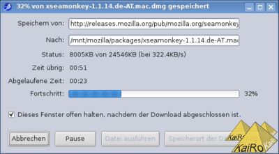
This UI had a few problems from my POV: The target and source locations grow out of the visible area, there's a lot of white space wasted, many buttons that you need to parse to know what they're doing, and it generally feels a bit old-style to me (not to talk about the code, that really calls for throwing away and rewriting). Because of that, I decided to rewrite the whole UI, based on what toolkit's download manager is showing for its entries, only taking what information should be available from the old implementation but redoing everything else. Yesterday, I basically finished my implementation and while I'm holding back on attaching the code to the bug report for the moment to make it base on a hopefully-soon-appearing new backend patch from Justin, I requested UI-review based on screen shots.

This is how the new dialog looks while pausing or downloading a file:
Image No. 20969

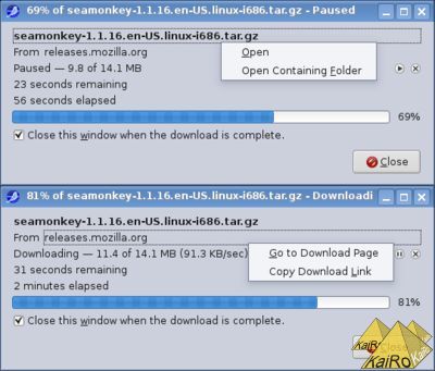
The dropdowns you see on the local file name and the download host come up on either left or right click on those labels in the dialog, and the download can be controlled with the pause/play/cancel icons near the left browser of the dialog. Yes, it's not a copy of the old UI in new code, it's a complete rewrite of the functionality, trying to make the dialog cleaner and easier to understand. What do you think?

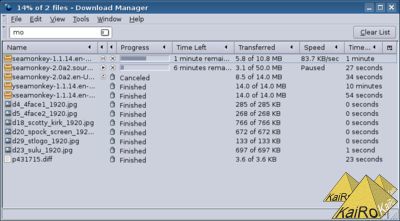
And for those of you who only think "Eww! Download progress dialogs are soo backwards, only really old software uses such a thing!" you can be assured that the default mode of operation for SeaMonkey 2 will be to show the download manager window instead (a hidden pref will probably even allow you to switch to the toolkit implementation), which will look like this:

Image No. 20970

Beitrag geschrieben von KaiRo und gepostet am 12. April 2009 14:54 | Tags: download manager, Mozilla, SeaMonkey, SeaMonkey 2 | 15 Kommentare | TrackBack

Kommentare

Seiten (2): [1] 2 >| (Beitrag 1-10/15)

AutorBeitrag

Vladimir

aus RU

zitieren
Download dialog
>>>What do you think?

I think it is not "cleaner and easier to understand". (Download progress dialog)

I don't see the source location now.
I have to copy it from context menu then open text editor and paste into it. Domain is not enough.

2 new FF-style buttons are too small. And position of that buttons is strange.

For what do you add the new button - close???
And it's placed alone at the empty bottom. ("there's a lot of white space wasted")

In new version I see 2 close buttons with (x). It is not cleaner.

In SM 1.x there's a cleaner column of actions (Saving from, to, status, ...) at the left of Download dialog. In the new Download dialog it looks not cleaner.


Download progress dialog in SM 1.x is modern and user-friendly!
May be "From:" is better than "Saving from:" and that's all.


Pay attention to Save as Web page complete please. It is absolutely impossible that modern browser can't save pages with css and images. This is the real problem - not Download dialog - it is very good in SM 1.x
12.04.2009 17:54

Eduardo BR

aus Rio de Janeiro - Brasil

zitieren
GOOD JOB !!!
Good job, Kairo!!! But a prefer the background white on download manager.

You need create something to people know the options when click.
12.04.2009 18:59

Nick

zitieren
I think it's an improvement. But think about all of these thing:

- 9.8MB of 14.1MB
- 23 seconds remaining
- 51 seconds elapsed
- the progress bar

They're all different representations of the same thing -- progress. Maybe they could be combined somehow?
12.04.2009 22:47

skierpage

aus USA

zitieren
nice
Put
  "2 minutes elapsed - 31 seconds remaining"
on the same line, one phrase left-aligned and the other phrase right-aligned over the two ends of the progress bar.

I also would prefer seeing some of the path to the download URL as well as the domain. Especially if I Save As... under a different name, so I'm saving A_New_Seamonkey.tar.gz from http://releases.mozilla.org/ ... seamonkey-1.1.16.en-US.linux-i686.tar.gz.

There's always a confusion between the URL you're downloading and the page you were looking at when you clicked the URL to download, I hope the download manager remembers both.

Is there a long-term vision to merge Download Manager into Places? Places remembers URLs you've visited, and URLs you've bookmarked, and from some of those you download URLs. So Download Manager could be just a third view into Places.

P.S. Thanks for all your hard work on the new version of Netscape Navigator Gold! :-)
12.04.2009 22:59

OldSkool

aus USA

zitieren
The proposed new one is definitely not an improvement. A drop down menu on a dialog seems out of place and those play/resume buttons are easily missed, besides it is a progress dialog not a media player. To what end does it serve to change the look of this from the existing progress dialog ? Just because you don't like progress dialogs doesn't mean that everyone doesn't like them. Did you consider doing user research first to determine what users really want or is SeaMonkey going the way of Firefox and simply doing what the developers want with no regard for users ?
13.04.2009 04:41

MattW

zitieren
Labels don't look like click targets, so menus attached to them won't get discovered. Needs to be an indication that you can do things by clicking, otherwise no clicking will happen.
13.04.2009 08:01

Jens Hatlak

aus Frankfurt, Germany

zitieren
Usability concerns
First, thanks for working on this. Please understand the following as constructive criticism only.

I have some usability concerns with the new design:

1. I agree with MattW that the context menus are not discoverable. Additionally they are hardly keyboard accessible. Maybe you could add a +/- icon (like the one found next to collapsed trees) that triggers the appearance of a new row containing the (keyboard-accessible) text fields of the old layout. The same action should then also be triggered by the same keys as used in trees (left and right cursor). You could keep the context menus on the labels as an alternative, though.

2. The play/pause and cancel buttons are too small and as such worse than the old Cancel button (which is much bigger). Fitts's law tells us that size (in combination with distance) is the important factor for successfully reaching a target using the mouse cursor. In your new design you only have one button, despite your "white space wasted" argument (one of Vladimir's points). I'd transform the play/pause icon into a button with changing label and icon (maybe becoming Restart when the download finishes). See my next point for the Cancel icon.

3. The Close button is ambiguous, especially when combined with the icon. It's obvious that it will close the window but it doesn't tell by itself that the download will continue in the background (unless the download window is the last SeaMonkey window, of course). I think people could easily confuse Close with Cancel. I suggest renaming Close to Continue in Background, adding a Cancel button (see point 2) and moving the icon over to that one. Once the download finishes Cancel would transform into Open, maybe with an additional Open Folder.

4. I like skierpage's idea of combining the remaining/elapsed counters in one row. If doing it on the two ends of the progress bar is too hard it would be enough the do it in one sentence, though.

5. I also like Eduardo's suggestion of using a white background for the Download Manager, as in the old one, the Bookmark Manager etc. After all this part of the window is active and offers some actions to the user (selecting a row, opening the context menu on it, resuming/pausing/restarting downloads etc.).

Final word to Mr. OldSkool: openly asking for comments like KaiRo is doing here is hardly "simply doing what the developers want with no regard for users", no? Unfortunately we don't have the manpower to do usability studies and neither do we have someone specifically working on usability, doing mockups etc. What's left is the developers who are usually not experts in this field. In the end someone has to come up with something, otherwise there is no progress (pun intended). It's not perfect, yet the best we can do until we're shown a better way.
13.04.2009 18:54

BenoitRen

zitieren
Old one was good except some things
I agree with most points raised by the ones who don't like the new dialog. I actually didn't think the old one was bad, except for one or two too many buttons and a checkbox that didn't really belong there.
13.04.2009 21:24

K

zitieren
Personally, I think the new dialog looks fine overall. I'm just glad that there is still an option to use progress dialogs at all, because I've never been a fan of download managers.

The only suggestion I have would be an easier way to tell where the file is being saved to. The Open Containing Folder context menu item will be useful, but it would be nice to have a way to see this information at a glance.
14.04.2009 05:50

KaiRo

Webmaster

zitieren
Quote of K:
The only suggestion I have would be an easier way to tell where the file is being saved to.

The full local path appears in a tooltip when you move the mouse over the filename displayed at the first line of the dialog (same for the download host and the full source URL), I hope that helps.

A good number of comments here sound like things might not looks as bad when you actually have a test build with those dialogs enabled. Perhaps, if I find the time, I can come back on the offer of the Mozilla Messaging team to test their new try server and produce builds that contain the whole suite of downloadmanager patches, including those progress dialogs.
14.04.2009 14:50

Seiten (2): [1] 2 >| (Beitrag 1-10/15)

Kommentar hinzufügen