The roads I take...
KaiRo's weBlog
| Zeige Beiträge veröffentlicht im April 2009 und mit "SeaMonkey 2" gekennzeichnet an. Zurück zu allen aktuellen Beiträgen | |||||||||||||||||||||||||||||||||||||||||||
12. April 2009
Download Progress Dialogs? Eww!
I wrote before that I was working on the new download manager UI for SeaMonkey 2. To lift off some work from Justin's shoulders, who fights with flaky (and sometimes just-down) internet connections as well as time constraints due to multiple jobs and a very young son next to volunteering for our project, I decided to also do the redesign of the per-download progress dialogs that we still want to and will support with SeaMonkey 2.

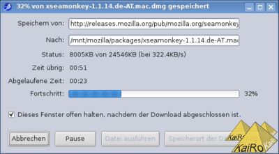
Using those dialogs instead of the download manager window is not the default, and I've never used them since the suite had the download manager UI, but here's how such a dialog looks on SeaMonkey 1.x (on my Linux machine, this is from a German L10n build):

This UI had a few problems from my POV: The target and source locations grow out of the visible area, there's a lot of white space wasted, many buttons that you need to parse to know what they're doing, and it generally feels a bit old-style to me (not to talk about the code, that really calls for throwing away and rewriting). Because of that, I decided to rewrite the whole UI, based on what toolkit's download manager is showing for its entries, only taking what information should be available from the old implementation but redoing everything else. Yesterday, I basically finished my implementation and while I'm holding back on attaching the code to the bug report for the moment to make it base on a hopefully-soon-appearing new backend patch from Justin, I requested UI-review based on screen shots.
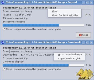
This is how the new dialog looks while pausing or downloading a file:

The dropdowns you see on the local file name and the download host come up on either left or right click on those labels in the dialog, and the download can be controlled with the pause/play/cancel icons near the left browser of the dialog. Yes, it's not a copy of the old UI in new code, it's a complete rewrite of the functionality, trying to make the dialog cleaner and easier to understand. What do you think?
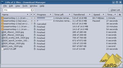
And for those of you who only think "Eww! Download progress dialogs are soo backwards, only really old software uses such a thing!" you can be assured that the default mode of operation for SeaMonkey 2 will be to show the download manager window instead (a hidden pref will probably even allow you to switch to the toolkit implementation), which will look like this:


Using those dialogs instead of the download manager window is not the default, and I've never used them since the suite had the download manager UI, but here's how such a dialog looks on SeaMonkey 1.x (on my Linux machine, this is from a German L10n build):
This UI had a few problems from my POV: The target and source locations grow out of the visible area, there's a lot of white space wasted, many buttons that you need to parse to know what they're doing, and it generally feels a bit old-style to me (not to talk about the code, that really calls for throwing away and rewriting). Because of that, I decided to rewrite the whole UI, based on what toolkit's download manager is showing for its entries, only taking what information should be available from the old implementation but redoing everything else. Yesterday, I basically finished my implementation and while I'm holding back on attaching the code to the bug report for the moment to make it base on a hopefully-soon-appearing new backend patch from Justin, I requested UI-review based on screen shots.
This is how the new dialog looks while pausing or downloading a file:
The dropdowns you see on the local file name and the download host come up on either left or right click on those labels in the dialog, and the download can be controlled with the pause/play/cancel icons near the left browser of the dialog. Yes, it's not a copy of the old UI in new code, it's a complete rewrite of the functionality, trying to make the dialog cleaner and easier to understand. What do you think?
And for those of you who only think "Eww! Download progress dialogs are soo backwards, only really old software uses such a thing!" you can be assured that the default mode of operation for SeaMonkey 2 will be to show the download manager window instead (a hidden pref will probably even allow you to switch to the toolkit implementation), which will look like this:
Von KaiRo, um 14:54 | Tags: download manager, Mozilla, SeaMonkey, SeaMonkey 2 | 15 Kommentare | TrackBack: 0
