<< "Webby" browser UI on mobile? It's FirefoxOS or nothing. | The roads I take... | 47 >>
LCARStrek 2.16 Brings Updated Look
Every six weeks, it's time for a new release of Firefox and SeaMonkey, and along with them, updates for my EarlyBlue and LCARStrek themes to match those Firefox and SeaMonkey releases. Of course, I personally am using them with the Nightly versions and try to keep them working with those, so they are usable with newer versions already, but only after I incorporate changes from the beta cycle, they're really fully up to date with the release versions.
That said, I kinda had my worries with the buttons of LCARStrek being not really discoverable unless you move your mouse over them, and also about the theme feeling "too orange", esp. after I reviewed some shots of LCARS screens in Star Trek series and once again saw both the shapes of buttons there, which are very discoverable, and also the amount of colors used there.
So I finally decided to something about it and added some gradual changes to LCARStrek 2.16, see e.g. the buttons, tab and scrollbars colors in those two screenshots (left is a Firefox release with 2.15, right is a Nightly with 2.16, that's why it also has an additional "Data Choices" tab):
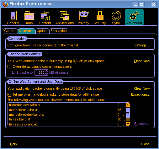
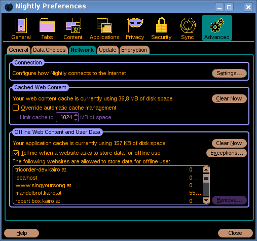
The new colors are taken directly from video screenshots of the series, so they should be pretty "true to the original". Actually, I copied the colors for buttons and default buttons directly from buttons in those screen shots. Trying to apply the same color to more button-like elements, I also converted buttons to that color and a larger border radius similar to that of the fully-rounded buttons.
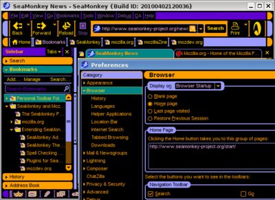
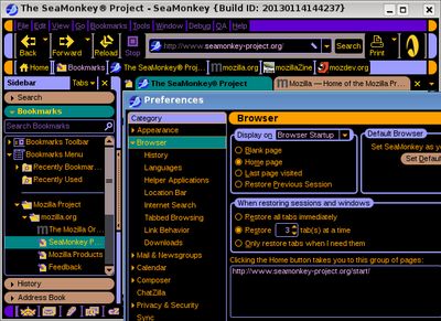
While I was at it, I also took the orange off the primary toolbars and replaced it with a gray color taken from some screen that I think I saw on Voyager shots. And I always wanted to get some more of the connected horizontal and vertical borders found usually in LCARS screens, but that needs to have enough elements to construct, so it's hard to do in a theme. I found a way to get this design into the SeaMonkey sidebar though - and also used that new button color for its headers which act similarly to buttons as well. See those two screenshots from LCARStrek 2.0 (left) and now 2.16 (right) on SeaMonkey (of course, some small non-theme-reated changes in SeaMonkey UI are visible as well, as the application itself saw some development since 2.0):
I hope I caught all the fine details that come along with far-reaching changes like esp. the one for the buttons, I've done a number of corrective changes along with this.
Still I had some time left and enough elements to play with to give SeaMonkey's profile switcher some real beauty in LCARS terms (you also see the different color for default buttons in there):
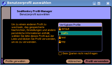
Unfortunately, this only applies to "Switch Profile…" from within a running SeaMonkey profile, as a theme like LCARStrek can only apply in that situation and not on the profile manager seen on application startup, where no profile and therefore no add-on or theme is loaded yet.
The new LCARStrek 2.16 version has been submitted to AMO, but is waiting for review now. Once that is granted, all users of this theme will see that updated look, and I hope they'll like it!
I probably will work on updating the look of more parts of this theme as time allows and I find things that should look differently.
That said, I kinda had my worries with the buttons of LCARStrek being not really discoverable unless you move your mouse over them, and also about the theme feeling "too orange", esp. after I reviewed some shots of LCARS screens in Star Trek series and once again saw both the shapes of buttons there, which are very discoverable, and also the amount of colors used there.
So I finally decided to something about it and added some gradual changes to LCARStrek 2.16, see e.g. the buttons, tab and scrollbars colors in those two screenshots (left is a Firefox release with 2.15, right is a Nightly with 2.16, that's why it also has an additional "Data Choices" tab):
The new colors are taken directly from video screenshots of the series, so they should be pretty "true to the original". Actually, I copied the colors for buttons and default buttons directly from buttons in those screen shots. Trying to apply the same color to more button-like elements, I also converted buttons to that color and a larger border radius similar to that of the fully-rounded buttons.
While I was at it, I also took the orange off the primary toolbars and replaced it with a gray color taken from some screen that I think I saw on Voyager shots. And I always wanted to get some more of the connected horizontal and vertical borders found usually in LCARS screens, but that needs to have enough elements to construct, so it's hard to do in a theme. I found a way to get this design into the SeaMonkey sidebar though - and also used that new button color for its headers which act similarly to buttons as well. See those two screenshots from LCARStrek 2.0 (left) and now 2.16 (right) on SeaMonkey (of course, some small non-theme-reated changes in SeaMonkey UI are visible as well, as the application itself saw some development since 2.0):
I hope I caught all the fine details that come along with far-reaching changes like esp. the one for the buttons, I've done a number of corrective changes along with this.
Still I had some time left and enough elements to play with to give SeaMonkey's profile switcher some real beauty in LCARS terms (you also see the different color for default buttons in there):
Unfortunately, this only applies to "Switch Profile…" from within a running SeaMonkey profile, as a theme like LCARStrek can only apply in that situation and not on the profile manager seen on application startup, where no profile and therefore no add-on or theme is loaded yet.
The new LCARStrek 2.16 version has been submitted to AMO, but is waiting for review now. Once that is granted, all users of this theme will see that updated look, and I hope they'll like it!
I probably will work on updating the look of more parts of this theme as time allows and I find things that should look differently.
Beitrag geschrieben von KaiRo und gepostet am 18. Februar 2013 18:46 | Tags: Firefox, LCARStrek, Mozilla, SeaMonkey, themes | keine Kommentare | TrackBack
Kommentare
Keine Kommentare gefunden.
