The roads I take...
KaiRo's weBlog
| Zeige Beiträge veröffentlicht im November 2013 und auf Englisch an. Zurück zu allen aktuellen Beiträgen | |||||||||||||||||||||||||||||||||||||||||||
18. November 2013
Bye, Bye, My Customizations - Hello New Ones?
Australis is landing on Nightly and therefore in my builds, and so it's time to review my customizations.
The illustrations below are from my pre-Australis state (though with my custom LCARStrek theme removed to make it easier to see what the customizations are). I still need to figure out the post-Australis state fully.

For one thing, I like having everything bookmark-like bundled in the bookmarks toolbar. That starts with the home button (that goes to my custom start page), the bookmarks menubutton, and then quick-access bookmark items like a menu with Bugzilla query live feeds and frequently visited sites. All those items, including the home and bookmarks buttons, have the same layout of an icon with text next to it and the same small height. I'm using the home button quite frequently to get to that site, same for the bookmark items, and I'm using the bookmarks list in the menubutton for retrieving sites I rarely visit (so they're often falling off the awesomebar) but want to go to every now and then (say, those sites where I buy karaoke songs every few months - I might not remember the exact name but I know where to find them in my bookmarks hierarchy). Australis removes the text from the buttons and actually makes them larger in height (which would make the whole toolbar higher), so I cannot place them in that place any more without breaking design. I might remove the home button completely and replace it with just a bookmark item pointing to the page, which should do the same job nicely (though the home button might not actually increase height, I need to test that a bit more). For the bookmarks button, I'm not sure. I don't feel like I want it at the right of any bar where it's far away from the bookmarks, and I don't want to size of the bookmarks bar to grow. Maybe I'll also hide it away completely, possibly place it in the "Hamburger" menu, as I don't use the starring feature too much anyhow, and move my whole bookmarks hierarchy to a folder on the bookmarks bar. That might seem strange in the logic of bookmark hierarchies, but it should do the job.

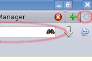
The throbber button at the right of my tab bar and the "Nightly" button on its left need to go as well, so I'll get rid of the former (even though it's an old friend from days gone by - but it's not even available for customization any more), and the latter is being morphed into the "Hamburger" button the right of the navigation bar, it's default location. While we're at the right of the navigation bar, I might think about removing the search field, actually. I find it annoying that it reminds me for hours of the last search I did because its content never goes away, and I do my Google searches from the location bar anyhow - and other searches by first going to the respective site and search from there. Maybe the old "Search Tabs" idea comes along one time and gives me nicer ways to use alternate search engines.

And then, there's add-ons. I have/had the Sync, Lightbeam and Diaspora EasyShare buttons as well as the MemChaser display in my add-ons bar. The Sync button is only showing if Sync is in progress and able to trigger one intentionally, I probably will remove that as I can easily live without it. Diaspora Easyshare might move to the bookmarks or even navigation bar, I'm not using it a lot but it actually looks very handy and I do use Diaspora quite a bit as my only social network. MemChaser will need to go away, unfortunately. It's nice to look at those numbers every now and then, esp. when problems might occur, but there's just no place in Australis where I can place a large and constantly updating thing like that without constant distraction. The bottom border of the screen/window was perfect for that. But OK, I'll probably end up removing or at least disabling the add-on completely. Lightbeam will either go away or move to the "Hamburger" menu - given how rarely I use it, it has no place at the top of my window in primary UI. While I'm at it, it might make sense to go through my add-ons list and do some cleanup there in general.
And once I get a feeling if I can do my work with the new "Hamburger" menu or not, I will see if I'll need to turn on the menu bar again or leave it hidden, like I've had it for a while now - but first I want to see how well the new stuff works for me so I can really evaluate it.
Unfortunately we don't have the capability in desktop FHR to track add-on behavior changes or uninstalls that might come with Australis (mobile has a new format that can track that), otherwise it would be interesting to see if it's just me or if others are disabling or uninstalling add-ons as well with that change.
What changes does this mean for you? Are you able to cope (like me), excited about them, or distracted by them?
The illustrations below are from my pre-Australis state (though with my custom LCARStrek theme removed to make it easier to see what the customizations are). I still need to figure out the post-Australis state fully.
For one thing, I like having everything bookmark-like bundled in the bookmarks toolbar. That starts with the home button (that goes to my custom start page), the bookmarks menubutton, and then quick-access bookmark items like a menu with Bugzilla query live feeds and frequently visited sites. All those items, including the home and bookmarks buttons, have the same layout of an icon with text next to it and the same small height. I'm using the home button quite frequently to get to that site, same for the bookmark items, and I'm using the bookmarks list in the menubutton for retrieving sites I rarely visit (so they're often falling off the awesomebar) but want to go to every now and then (say, those sites where I buy karaoke songs every few months - I might not remember the exact name but I know where to find them in my bookmarks hierarchy). Australis removes the text from the buttons and actually makes them larger in height (which would make the whole toolbar higher), so I cannot place them in that place any more without breaking design. I might remove the home button completely and replace it with just a bookmark item pointing to the page, which should do the same job nicely (though the home button might not actually increase height, I need to test that a bit more). For the bookmarks button, I'm not sure. I don't feel like I want it at the right of any bar where it's far away from the bookmarks, and I don't want to size of the bookmarks bar to grow. Maybe I'll also hide it away completely, possibly place it in the "Hamburger" menu, as I don't use the starring feature too much anyhow, and move my whole bookmarks hierarchy to a folder on the bookmarks bar. That might seem strange in the logic of bookmark hierarchies, but it should do the job.
The throbber button at the right of my tab bar and the "Nightly" button on its left need to go as well, so I'll get rid of the former (even though it's an old friend from days gone by - but it's not even available for customization any more), and the latter is being morphed into the "Hamburger" button the right of the navigation bar, it's default location. While we're at the right of the navigation bar, I might think about removing the search field, actually. I find it annoying that it reminds me for hours of the last search I did because its content never goes away, and I do my Google searches from the location bar anyhow - and other searches by first going to the respective site and search from there. Maybe the old "Search Tabs" idea comes along one time and gives me nicer ways to use alternate search engines.
And then, there's add-ons. I have/had the Sync, Lightbeam and Diaspora EasyShare buttons as well as the MemChaser display in my add-ons bar. The Sync button is only showing if Sync is in progress and able to trigger one intentionally, I probably will remove that as I can easily live without it. Diaspora Easyshare might move to the bookmarks or even navigation bar, I'm not using it a lot but it actually looks very handy and I do use Diaspora quite a bit as my only social network. MemChaser will need to go away, unfortunately. It's nice to look at those numbers every now and then, esp. when problems might occur, but there's just no place in Australis where I can place a large and constantly updating thing like that without constant distraction. The bottom border of the screen/window was perfect for that. But OK, I'll probably end up removing or at least disabling the add-on completely. Lightbeam will either go away or move to the "Hamburger" menu - given how rarely I use it, it has no place at the top of my window in primary UI. While I'm at it, it might make sense to go through my add-ons list and do some cleanup there in general.
And once I get a feeling if I can do my work with the new "Hamburger" menu or not, I will see if I'll need to turn on the menu bar again or leave it hidden, like I've had it for a while now - but first I want to see how well the new stuff works for me so I can really evaluate it.
Unfortunately we don't have the capability in desktop FHR to track add-on behavior changes or uninstalls that might come with Australis (mobile has a new format that can track that), otherwise it would be interesting to see if it's just me or if others are disabling or uninstalling add-ons as well with that change.
What changes does this mean for you? Are you able to cope (like me), excited about them, or distracted by them?
Von KaiRo, um 20:19 | 9 Kommentare | TrackBack: 0
7. November 2013
Internet Archive Fire: Donate to Rebuild
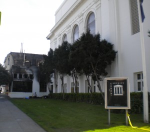
I just got word that a fire destroyed the Internet Archive Scanning Center in San Francisco.

I have blogged about what the archive has and can do a few months ago and I probably will mention it again when I get to more posts on preserving software.
I think it's in the best interest of everyone, esp. us as Mozillians, to keep this organization going and make the history of the Internet and more openly available to current and future generations.
Please help them to rebuild and continue on their way and make a Donation. I will for sure.
Von KaiRo, um 19:04 | Tags: history, Mozilla, preservation, software | keine Kommentare | TrackBack: 0
1. November 2013
Badges for Stability Contributions?
Various groups at Mozilla have been thinking about awarding Open Badges for contributors in the recent year or so (there's even a contributor badges site for easily awarding them). I again and again wonder if we could do that for stability contributions as well, but it's a tough nut to crack.

One idea would be to award badges automatically to people who leave their email in a crash report (i.e. a badge for taking part in our efforts by delivering data through crash reports) - but that would probably end up being a bad badge because you' award people for crashing Firefox (and not award people who don't see crashes). We really do not want people to search for how they can crash so that they can get a badge - after all our mission is to avoid crashes, not provoke them. So, no badges for submitting crashes (thanks to Benjamin for pointing me to that issue right away when I was rolling that idea).
So, how can we potentially award a badge for Stability/"CrashKill" work without rewarding bad behavior?
One thing I could think of was "filed x crash bugs that ended up fixed". That should be relatively easy to get out of Bugzilla data and I think there's no doubt that filing bugs that end up with a fixed resolution is a good thing.
This idea would also open up the avenue for different badges for different amounts of badges (similar to the webdev badges), or to create a badge for developers who fixed x crash bugs, and similar things.
What do you think? Which ideas do you have for awarding badges for contributions to the Mozilla Stability program?
Von KaiRo, um 18:14 | Tags: CrashKill, Mozilla | 1 Kommentar | TrackBack: 0
