<< Lantea Maps: GPS Track Upload to OpenStreetMap Broken | The roads I take... | Integration eines Magento-2-Webshops mit FreeFinance und selbstgebautem Warenmanagement >>

Celebrating LCARS With One Last Theme Release

30 years ago, a lot of people were wondering what the new Star Trek: The Next Generation series would bring when it would debut in September 1987. The principal cast had been announced, as well as having a new Enterprise and even the pilot's title was known, but - as always with a new production - a lot of questions were open, just like today in 2017 with Star Trek Discovery, which is set to debut in September almost to the day on the 30th anniversary of The Next Generation.

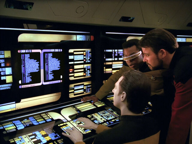
Given that the story was set to play 100 years after the original and what was considered "futuristic" had significantly changed between the late 1960s and 1980s, the design language had to be significantly updated, including the labels and screens on the new Enterprise. Scenic art supervisor and technical consultant Michael Okuda, who had done starship computer displays for The Voyage Home, was hired to do those for the new series, and was instructed by series creator and show runner Gene Roddenberry that this futuristic ship should have "simple and clean" screens and not much animation (the latter probably also due to budget and technology constraints - the "screens" were built out of colored plexiglass with lights behind them).


With that, Okuda created a look that became known as "LCARS" (for Library Computer Access and Retrieval System (which actually was the computer system's name). Instead of the huge gray panels with big brightly-colored physical buttons in the original series, The Next Generation had touch-screen panels with dark background and flat-style buttons in pastel color tones. The flat design including the fonts and flat-design frames are very similar to quite a few designs we see on touch-friendly mobile apps 30 years later. Touch screens (and even cell phones and tablets) were pretty much unheard of and "future talk" when Mike Okuda created those designs, but he came to pretty similar design conclusions as those who design UIs for modern touch-screen devices (which is pretty awesome when you think of it).

I was always fascinated with that style of UI design even on non-touch displays (and am even more so now that I'm using touch screens daily), and so 18 years ago, when I did my first experiments with Mozilla's new browser-mail all-in-one package and realized that the UI was displayed with the same rendering engine and the same or very similar technologies as websites, I immediately did some CSS changes to see if I could apply LCARS-like styling to this software - and awesomeness ensued when I found out that it worked!

Image No. 23114

Over the years, I created a full LCARStrek theme from those experiments (first release, 0.1, was for Mozilla suite nightlies in late 2000), adapted it to Firefox (starting with LCRStrek 2.1 for Firefox 4), refined it and even made it work with large Firefox redesigns. But as you may have heard, huge changes are coming to Firefox add-ons, and full-blown themes in a manner of LCARStrek cannot be done in the new world as it stands right now, so I'm forced to stop developing this theme.

Image No. 23308

Given that LCARS has a huge anniversary this year, I want to end my work on this theme on a high instead of a too sad a note though, so right along the very awesome Star Trek Las Vegas convention, which just celebrated 30 years of The Next Generation, of course, I'm doing one last LCARStrek release this weekend, with special thanks to Mike Okuda, whose great designs made this theme possible in the first place (picture taken by myself at that convention just two weeks ago, where he was talking about the backlit LCARS panels that were dubbed "Okudagrams" by other crew members):
Image No. 23314

Live long and prosper!

Beitrag geschrieben von KaiRo und gepostet am 20. August 2017 00:21 | Tags: Firefox, LCARStrek, Mozilla, SeaMonkey, Star Trek, themes | 5 Kommentare | TrackBack

Kommentare

AutorBeitrag

Takeshi Kinami

zitieren
Much appreciated!
I've been using this theme for more than 10 years--it's always been my favorite.
Any chance you'd adapt it for the Palemoon browser's add-ons site? They still support complete themes, and PM is now my main browser.
25.09.2017 01:14

KaiRo

Webmaster

zitieren
Thanks for the support. I will not put anything on PaleMoon's add-ons site, no, I'm done with developing full themes on this site and I'm looking forward to the future, putting my energy into more forward-thinking projects, not in backwards-oriented projects like Pale Moon and others that try to stop the time rather than help building an exciting new future (which is what LCARStrek was always about).

Zuletzt bearbeitet von KaiRo am 20.12.2017 16:02

31.10.2017 18:25

Rekufad

aus Argentina

zitieren
A clarification about Pale Moon
KaiRo, before underestimating Pale Moon by considering it as a second-hand browser or "legacy", you should read https://forum.palemoon.org/viewtopic.php?f=4&t=7818 and especially https://forum.palemoon.org/viewtopic.php?f=4&t=17528
11.12.2017 09:04

Louis Wu

zitieren
Have to second that. Pale Moon isn't primitive. It isn't static. It is committed to not breaking other people's work without need. Best browser out there for linux. YMMV.
13.02.2018 08:18

Louis Wu

zitieren
It would be nice if you could publish all the older versions. The old versions on mozilla.org (actually hosted on mozilla.net) don't seem to go back too far. I still may be able to finagle one into working. Probably a lot of the Lcars fans are people like me with less common types of color vision (color blindness is very much a misnomer for us - we see as many colors as anyone - we just see them differently). So for people desperately squinting at this page through bleeding eyeballs, try this with Pale Moon:
Setting:
Reverse the black and white settings in content, colors.
Theme:
"In the Dark"
Extensions:
"Page Colors and Fonts Buttons"
"Theme Tweaker"
13.02.2018 08:34

Kommentar hinzufügen